

How to coordinate gift wrap colours for celebrations
TL;DR:
- Coordinating gift wrap colours involves selecting two to three complementary shades and textures to create an elegant presentation. Using restraint enhances perceived quality, with layered palettes and textured embellishments elevating even simple gifts. Colour psychology influences emotional impact, making thoughtful palette choices appropriate for occasions like baby showers and birthdays.
Coordinating gift wrap colours is the art of selecting 2–3 complementary shades and textures to craft a stylish, meaningful gift presentation. For occasions as tender as a baby shower or as joyful as a child’s birthday, the wrapping itself becomes part of the gift. Colour psychology, the rule of three palette principle, and thoughtful texture layering are the three pillars of a truly polished result. When you know how to coordinate gift wrap colours with intention, even a modest present arrives with the quiet elegance of something truly considered.
How to coordinate gift wrap colours: the palette principles
The single most effective rule in gift wrapping colour coordination is restraint. Limiting your palette to 2–3 primary tones creates a cohesive, high-end presentation that feels deliberate rather than accidental. This is the foundation of what designers call the rule of three, and it applies as naturally to gift wrap as it does to interior styling.
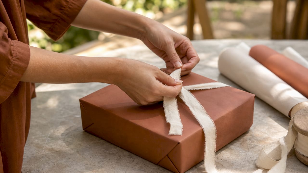
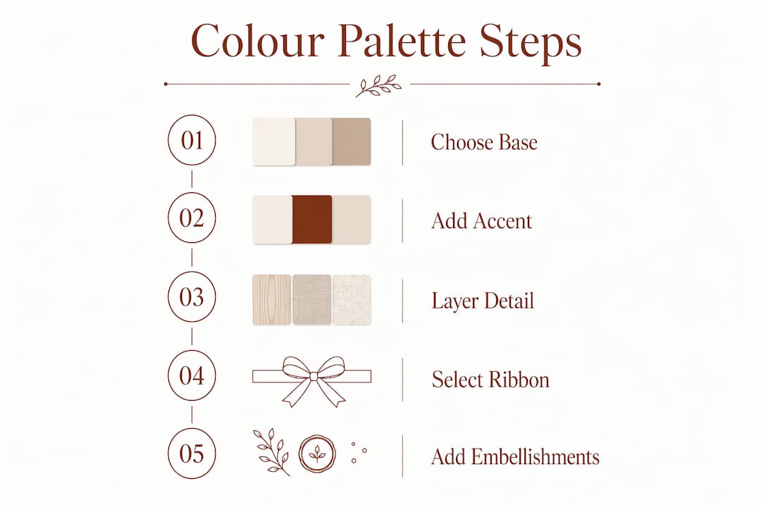
A well-chosen palette works in three layers: a base colour, a secondary accent, and a finishing detail tone. Soft sage green as a base, ivory as the accent, and a warm gold ribbon as the finishing detail creates a palette that feels both fresh and refined. For a birthday, try a deep navy base with blush pink accents and a silver ribbon. Each combination tells a story before the paper is even torn.
The perceived quality of a gift rises or falls with palette choice. Deeper, richer hues such as navy or emerald confer a considered, premium impression. Pale, washed-out combinations can feel unintentional. Choose tones with enough depth to hold their own against the texture of your ribbon and wrap.
Here are three popular palettes suited to celebrations:
- Baby shower softness: Blush pink, ivory, and soft gold. Gentle, warm, and universally beloved for newborn gifting.
- Birthday vibrancy: Cobalt blue, sunshine yellow, and white. Bold, cheerful, and visually exciting for children’s parties.
- Gender-neutral newborn: Sage green, warm cream, and terracotta. Earthy, modern, and quietly luxurious.
| Palette style | Base colour | Accent colour | Finishing detail |
|---|---|---|---|
| Baby shower | Blush pink | Ivory | Soft gold |
| Children’s birthday | Cobalt blue | Sunshine yellow | White |
| Gender-neutral newborn | Sage green | Warm cream | Terracotta |
| Classic luxury | Midnight navy | Champagne | Silver |
Pro Tip: Choose your ribbon colour last. Lay the wrapped gift on a flat surface and hold ribbon options against it before committing. Natural light reveals tonal clashes that artificial light disguises.
How can colour psychology enhance the emotional impact of your gift wrapping?
Colours act as silent messengers, expressing care and setting the emotional tone before a gift is opened. This is not a decorative afterthought. The colour you choose communicates something about how you feel about the recipient, and they register it subconsciously the moment they see the parcel.
Understanding basic colour meanings gives you a quiet advantage:
- Pink and blush: Tenderness, warmth, and new beginnings. Ideal for baby showers and newborn gifts.
- Blue: Calm, trust, and serenity. Suits both baby boys and thoughtful adult gifts.
- Gold and champagne: Celebration, generosity, and luxury. Works beautifully as an accent for any occasion.
- White and ivory: Purity, simplicity, and elegance. A timeless base for any palette.
- Red: Excitement, passion, and festivity. Powerful for birthdays but use sparingly to avoid visual overwhelm.
- Sage and soft green: Growth, nature, and tranquillity. A modern choice for gender-neutral newborn gifts.
“Selecting wrap colour based on the recipient’s emotional world enhances the perceived value of the gift itself.” — colour psychology research on gift presentation
Matching colour to occasion deepens the emotional resonance of your gift. Pinks and pastels suit baby showers because they mirror the softness of new life. Bold colours enliven birthdays, reflecting the energy and excitement a child feels on their special day. The wrap becomes a prelude, setting the mood for the moment of opening.
Pro Tip: When gifting a newborn, consider the parents as much as the baby. Soft sage, ivory, and warm cream feel calming and sophisticated for adults while remaining perfectly tender for a new arrival.
What practical techniques help coordinate ribbons and embellishments?
Ribbon is where your palette comes alive in three dimensions. Matching ribbon tonally or using complementary colours achieves either subtle elegance or impactful contrast, depending on the effect you want. A tonal match, such as a dusty rose ribbon on blush paper, feels serene and refined. A complementary contrast, such as vibrant purple ribbon on a yellow box, creates memorable, high-impact presentation.
The professional trick that elevates wrapping from pleasant to polished is ribbon layering. Thick velvet topped with thin satin picot edge ribbon creates a sculptural effect that adds depth without adding colour complexity. This technique works especially well on reusable fabric wraps, where the tactile contrast between the fabric and the ribbon becomes part of the gift’s sensory appeal.
Texture combinations deserve as much thought as colour combinations. Matte paper paired with satin ribbon or rough jute tied with delicate lace adds depth to even a single-colour scheme. Coordinated textures are the secret to keeping a restrained palette dynamic and sophisticated. Avoid pairing two shiny surfaces or two matte surfaces together, as the result feels flat and one-dimensional.
Finishing details matter more than most people realise. Tape type should match your wrapping paper texture: glossy tape for shiny paper, matte tape for kraft or textured paper. Visible tape seams break the visual harmony of even the most carefully chosen palette. Take the extra moment to fold clean edges and press seams flat before adding your ribbon.
Here is a practical sequence for assembling your finishing details:
- Wrap the gift cleanly, pressing all folds firmly before taping.
- Choose your base ribbon width first, then select a thinner accent ribbon in a complementary or tonal shade.
- Layer the thinner ribbon over the thicker, securing both at the bow point.
- Add a sprig of dried botanicals, a handwritten tag, or a wax seal in your palette’s accent colour.
- Step back and assess the overall composition in natural light before presenting.
Pro Tip: Dried botanicals such as eucalyptus, cotton stems, or lavender add a nature-inspired finishing touch that photographs beautifully and costs very little. They work especially well with fabric wraps for a luxury children’s gift presentation.
How to plan gift wrap coordination for baby showers and children’s birthdays
Occasion-specific planning transforms good wrapping into genuinely memorable presentation. For baby showers, the palette should feel as soft and gentle as the occasion itself. Blush, ivory, sage, and warm cream all work beautifully, and the rule of three palette keeps the overall table of gifts looking cohesive when multiple wrapped presents are displayed together.
For children’s birthdays, the palette can afford more energy. Cobalt, sunshine yellow, coral, and bright white all sing with the joy of the occasion. The key is still restraint: choose two bold tones and one neutral, rather than reaching for every colour in the spectrum. The result feels festive without becoming chaotic.
Personalisation lifts any wrapping scheme from beautiful to unforgettable. Reusable fabric gift wrap supports both sustainability and personalisation, making it a natural choice for newborn and toddler gifts. Nicholasandrose offers fabric wraps that can be personalised through embroidery, creating a keepsake the family will treasure long after the paper would have been discarded. The wrap itself becomes part of the gift.
Planning ahead is the quiet discipline behind every beautiful presentation:
- Create a simple mood board using colour swatches, ribbon samples, and fabric textures before purchasing materials.
- Source all wrapping materials at the same time to guarantee tonal consistency across multiple gifts.
- Choose a unifying element, such as a consistent ribbon colour or a shared botanical detail, to tie individual gifts together when displayed as a group.
- Write handwritten tags in ink that complements your palette. Black ink on cream card, or gold ink on deep navy, both feel considered and personal.
- For baby shower gifts, consider wrapping in a Nicholasandrose fabric wrap that can later be used as a muslin, keepsake cloth, or nursery decoration.
Pro Tip: For a baby shower table, wrap all gifts in the same base colour and vary only the ribbon. The effect is a beautifully unified display that photographs like a professional styling shoot.
What common mistakes undermine gift wrap colour coordination?
The most common error is using too many colours. Overcrowding with many colours dilutes visual impact and cheapens the overall look, regardless of how expensive the individual materials are. Three colours, chosen with care, always outperform six colours chosen with enthusiasm.
Watch for these specific pitfalls:
- Clashing patterns: Stripes on stripes, or florals on florals, compete rather than complement. Pair a patterned paper with a solid ribbon, not another pattern.
- Mismatched ribbon width: A thin ribbon on a large gift looks lost. Scale your ribbon width to the size of the parcel.
- Visible tape: Tape that contrasts with the paper surface breaks the visual harmony immediately. Match tape finish to paper finish every time.
- Ignoring the underside: Messy folds on the base of a gift undermine the presentation even when the top looks perfect. Fold every surface with equal care.
- Forgetting the tag: A bare gift without a tag feels unfinished. The tag is part of the composition, not an afterthought.
Pro Tip: Before presenting any gift, turn it over and check every surface. The base and sides should look as considered as the top. A final two-minute inspection catches the small details that make the difference between good and exceptional.
Key takeaways
Coordinating gift wrap colours with restraint, texture layering, and occasion-specific palette choices produces a presentation that feels genuinely luxurious and emotionally resonant.
| Point | Details |
|---|---|
| Limit your palette | Use 2–3 colours only; more tones dilute impact and reduce perceived quality. |
| Match ribbon to paper | Choose tonal or complementary ribbon to create either subtle elegance or bold contrast. |
| Layer textures | Pair matte paper with satin ribbon or velvet with picot edge for sculptural depth. |
| Plan for the occasion | Use soft pastels for baby showers and vibrant tones for birthdays to match emotional tone. |
| Personalise with fabric wrap | Reusable fabric wraps, such as those from Nicholasandrose, add a lasting, embroidered keepsake. |
Why I believe the wrapping is never just the wrapping
I have spent years watching people unwrap gifts at baby showers and children’s birthdays, and the moment before the paper comes off is always the same. There is a pause. A breath. The wrapping creates anticipation, and that anticipation is shaped entirely by colour, texture, and care.
What I have noticed is that the most memorable gifts are rarely the most expensive. They are the ones where someone clearly thought about the presentation. A sage green fabric wrap tied with ivory velvet ribbon and a sprig of dried cotton stem communicates something that a hastily taped paper parcel simply cannot.
The shift toward reusable fabric wrapping, particularly for newborn and toddler gifts, feels genuinely right to me. The paper that most gifts arrive in is gone before the baby is even born, discarded in the excitement of the moment. A beautifully embroidered fabric wrap from Nicholasandrose stays. It becomes a muslin, a keepsake, a small piece of the story of that child’s earliest days. That is a different kind of gift entirely.
My honest advice is this: choose fewer colours, choose better textures, and choose wrapping that lasts. The sustainable gift wrapping process is not a compromise on beauty. It is, in my experience, the most beautiful choice of all.
— Helen
Beautifully wrapped, beautifully kept: gift wrap from Nicholasandrose
For celebrations as precious as a baby shower or a child’s first birthday, the wrapping deserves as much thought as the gift inside.
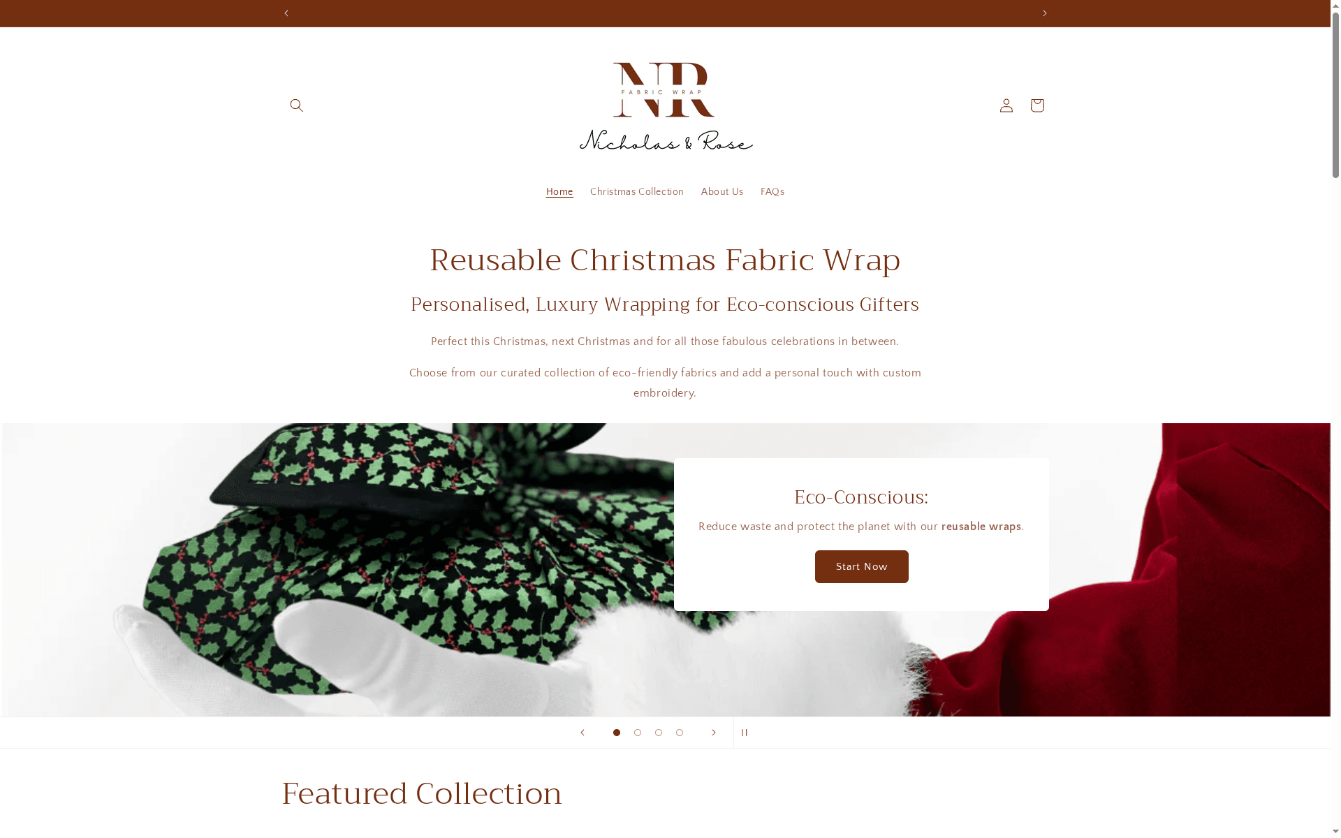
Nicholasandrose creates reusable fabric gift wraps personalised through embroidery, designed for newborn and toddler gifts that become lasting mementos. Each wrap is crafted to complement the soft, considered palettes that make a gift table truly beautiful. Explore the 2026 newborn gift wrap collection and find a wrap that becomes part of the gift itself, treasured long after any paper would have been forgotten.
FAQ
What is the best colour palette for a baby shower gift?
Blush pink, ivory, and soft gold form the most universally loved palette for baby shower gifts. Sage green, warm cream, and terracotta offer a modern, gender-neutral alternative that feels equally tender and refined.
How many colours should I use when coordinating gift wrap?
Limit your palette to 2–3 colours for the most polished result. Using more than three tones dilutes the visual impact and makes the presentation feel unplanned.
How do I match ribbon colour to wrapping paper?
Choose a ribbon that either matches your paper tonally for understated elegance, or sits opposite it on the colour wheel for bold contrast. Avoid ribbons that are only slightly different from the paper, as near-matches can look like accidental mismatches.
Can reusable fabric wrap be colour-coordinated like paper?
Reusable fabric wraps coordinate beautifully with ribbon and botanical embellishments. Nicholasandrose fabric wraps are available in tones suited to newborn and toddler gifting, and the embroidered personalisation adds a finishing detail that no paper wrap can replicate.
What is the most common mistake in gift wrap colour coordination?
Using too many colours is the most common error. Overcrowding a palette with four or more tones reduces perceived quality and creates visual noise. Restraint, combined with thoughtful texture layering, always produces the more refined result.
Recommended
- Best Curated Christmas Gift Wraps for Unique Gifting 2026 – Nicholas & Rose Limited
- How to embellish gift wraps sustainably: 2026 guide – Nicholas & Rose Limited
- 7 Personalised Gift Wrap Ideas for Eco-Conscious Gifting – Nicholas & Rose Limited
- Educational list on gift wrap reuse: UK guide – Nicholas & Rose Limited